MOI: Output
Introduction
This document describes the outputs produced by the MOI pipeline.
The directories listed below will be created in the user’s defined “results” directory after the completion of pipeline. All paths are relative to the top-level results’ directory.
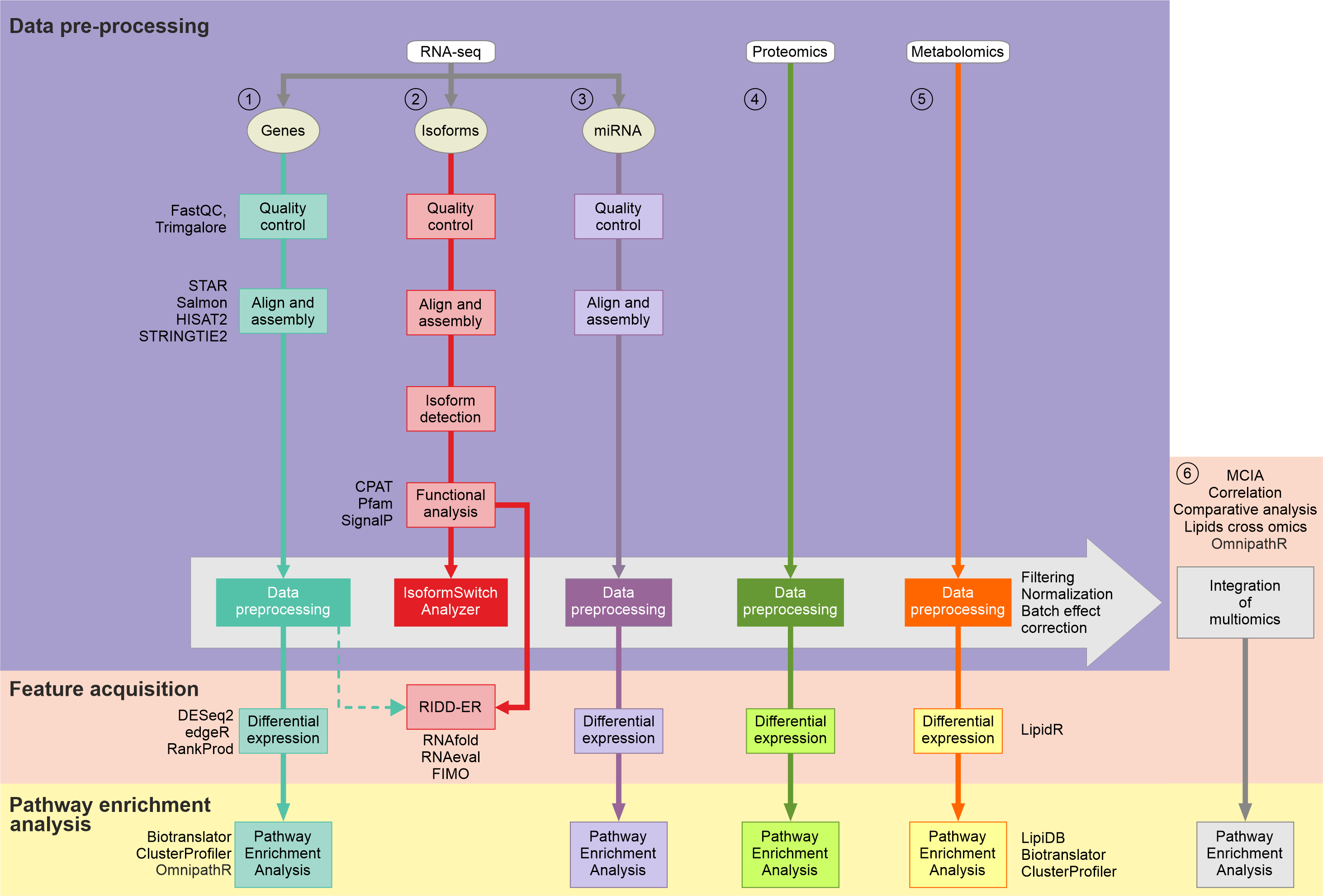
Pipeline overview
The pipeline is built using Nextflow and performs the following steps:
RNAseq analysis on the level of :
mRNAs
miRNAs
isoforms including lncRNAs
Functional annotation of transcripts
Lipidomics analysis
Proteomics analysis
Integration of multi omics data
See diagram:
RNAseq analysis
Plots included here are generated from RNAseq data however similar plots can be generated for proteomic data if provided with a count matrix and a samples info file:
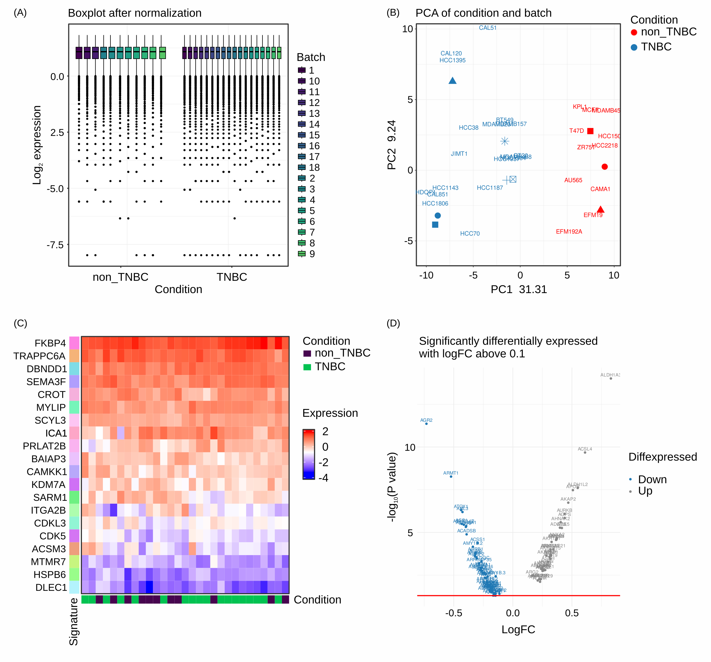
RNAseq analysis Box plots of samples after filtering and normalization steps (A) as well as PCA plots of raw and cleaned for batch effect samples (B) provide quality control of the data. Heatmaps (C) and Volcano plots (D) offer visual indications of differentially expressed features.
Output files
genes/filt: Directory of filtered matrices.norm: Directory of normalized matrices.edger(or rankprod or deseq2) : Directory of differentially expressed features.clusterprofiler: Directory of pathway enrichment analysisbiotranslator: Directory of pathway enrichment analysis performed with biotranslator
Isoform analysis
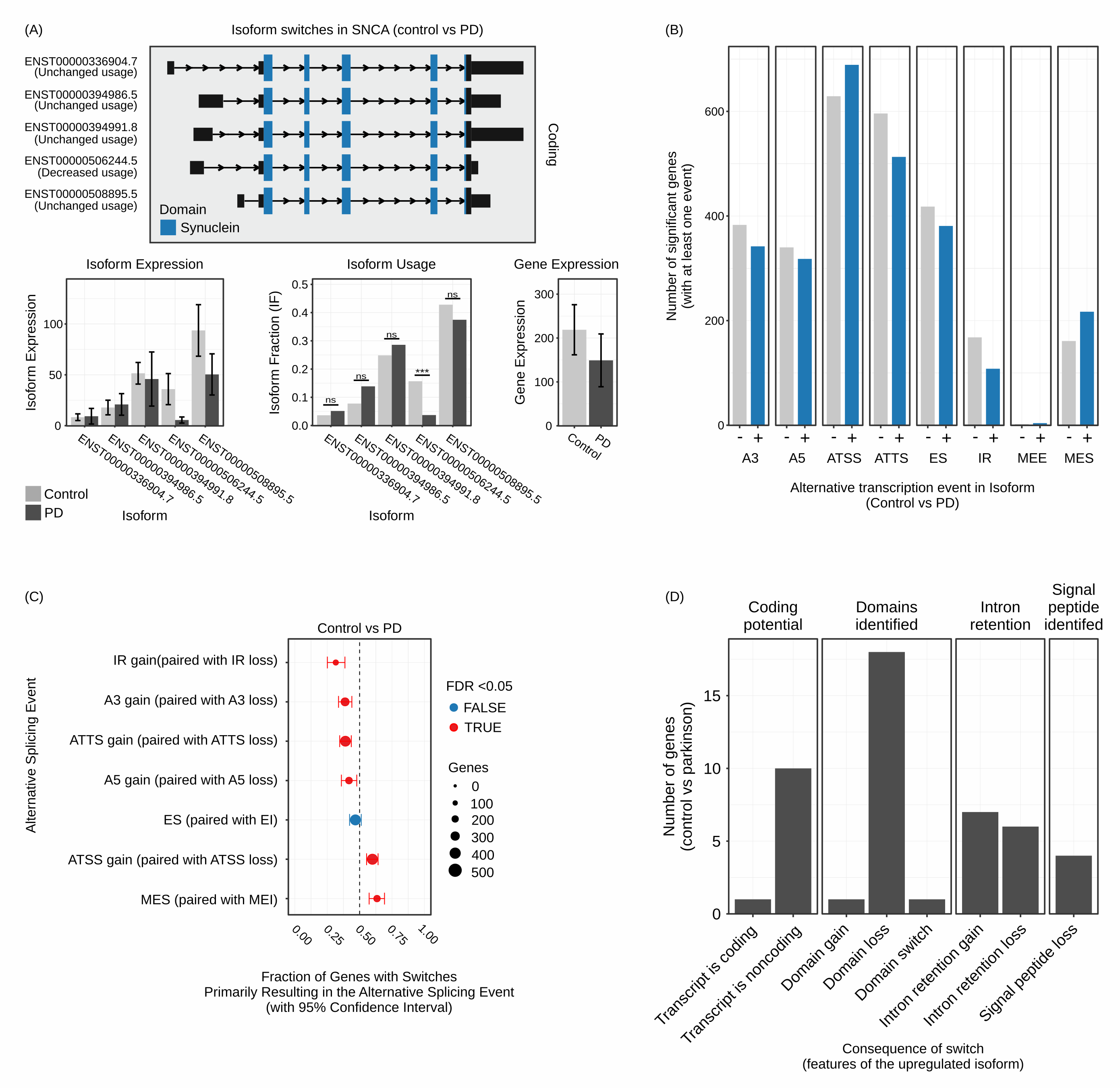
Isoform analysis (A) Different isoforms of SNCA mRNA are detected and annotated with respect to their coding potential and protein domains. Moreover, the relative expression of the gene is displayed along with the relative expression of the isoforms as well as the fraction of the isoforms used. (B) Bar plots representing the number of genes encompassing functional implications of isoform switching. (C) Dot-plots representing which of the functional implications of isoform switching are statistically significant between conditions. (D) Bar plots representing the distribution of the consequences of isoform switching events across genes.
Output files
isoforms/isopart1: Directory of first part of analysis from isoformSwitchAnalyzer.isopart2: Directory of second part of analysis from isoformSwitchAnalyzer.isovisual: Directory of visualization part of analysis from isoformSwitchAnalyzer.
Lipidomics analysis
Plots included here are generated if the user chose lipidr = true
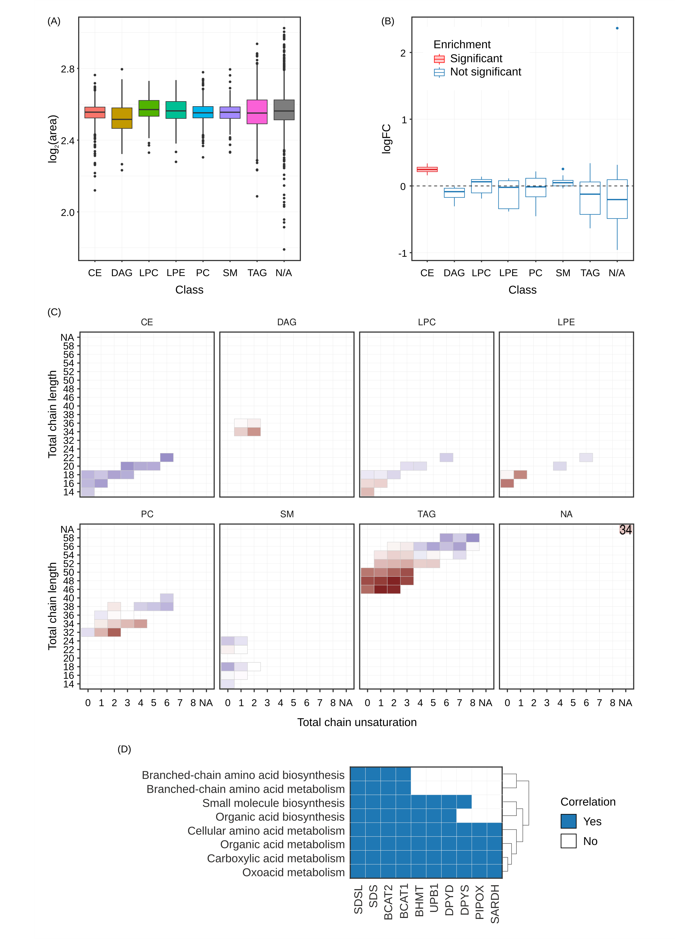
Lipids Box plots of the relative fold change for each class of lipids is displayed (A) along with the output showing whether that fold change is enriched between conditions (B). The different classes of lipids shown are ceramides (CE), diglycerides (DAG), lysophosphatidylcholines (LPC), lysophosphatidylethanolamines (LPE), phosphatidylcholine (PC), sphingomyelin (SM) and triaglycerides (TAG). Distribution of saturation levels for each class of lipids is shown in (C) and the most enriched pathways found using biotranslator in which these lipids participate is shown in (D).
Otherwise similar plots to those shown in [de_rnaprotmirna] will be generated.
Output files
lipids/lipidr/: Directory with extensive lipidomics analysis
Integration
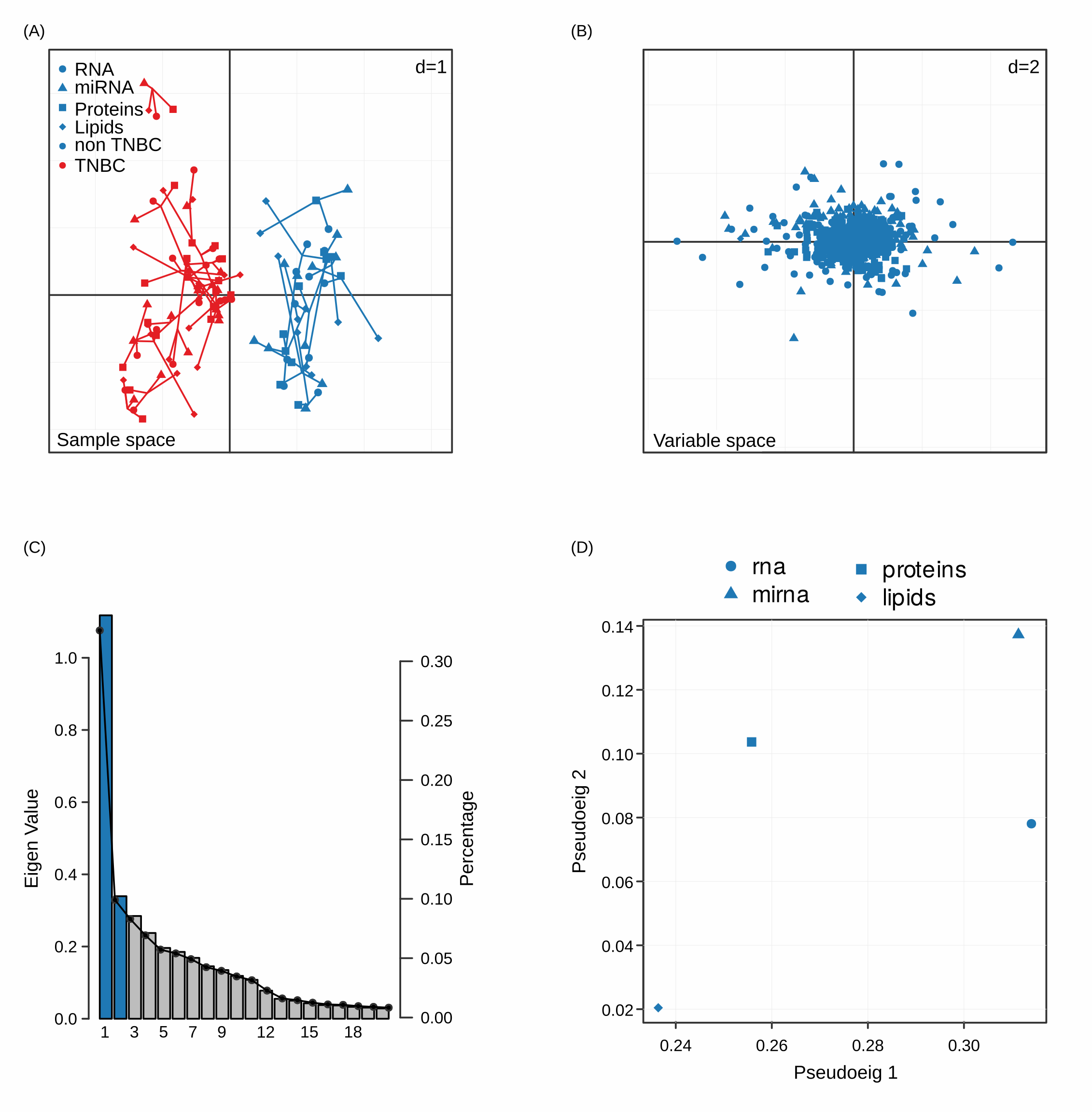
MCIA (A) MCIA reports the PCA of the sample space where we can see how samples differentiate according to the phenotype of interest. (B) In addition, variables are projected on the same space to explore the relative contribution of each variable to the distinction of the phenotypes. Elbow plots (C) inform us about the significant principal components and in panel (D) the space of the pseudo-eigen values of the different datasets is displayed, as an indication of the relative contribution to the variance observed.
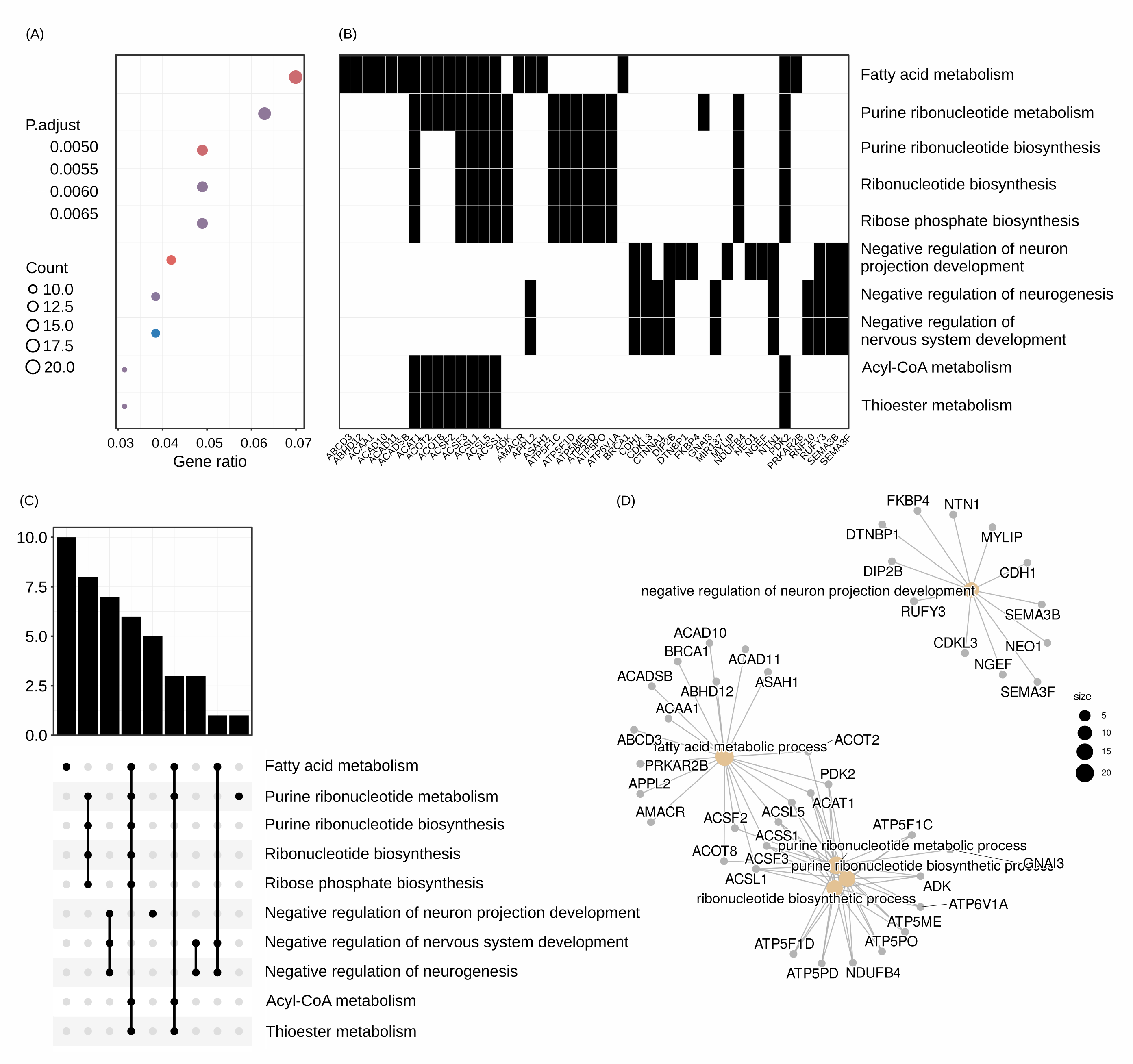
clusterprofiler Clusterprofiler can be utilized by individual analyses or after the integration step of MCIA. Outputs include heatmaps of enriched processes (A) and the top features that participate in these processes (B), as well as tree plots of significant pathways (C) and the network that these pathways form (D).
Output files
mcia/mcia_results/: Directory of mcia results, including MCIA report and analysis from clusterprofiler
Additional integration methods and biotranslator
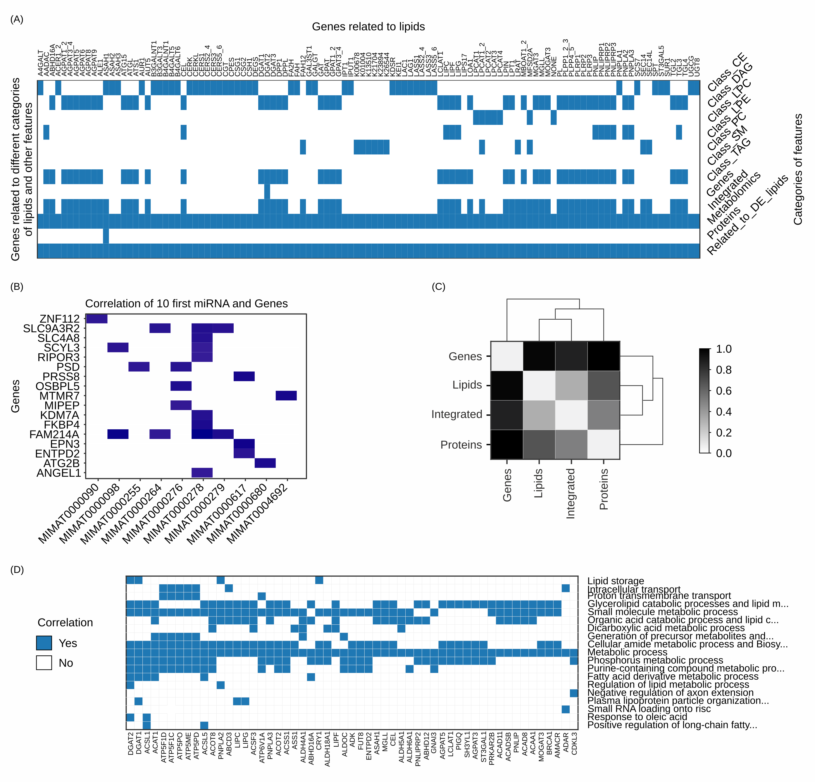
(A) MOI has unique tools for associating genes to the molecules found in metabolomic datasets and visualizing them across functional lipid categories and available omics data. (B) Correlation analysis performed with Pearson or Spearman can filter illuminating connection and patterns, aiding the noise mitigation for downstream analyses like pathway enrichment analysis (functional analysis). The example provided here shows the top 10 differentially expressed miRNA and their correlated genes. (C) The semantic distance matrix of feature signatures performed by our comparative analysis tool explores how closely connected regarding the biological ontologies two signatures are. Panel (D) shows the biological processes that hold the most descriptive information of the observed phenotype, interconnected with hub genes (x axis).
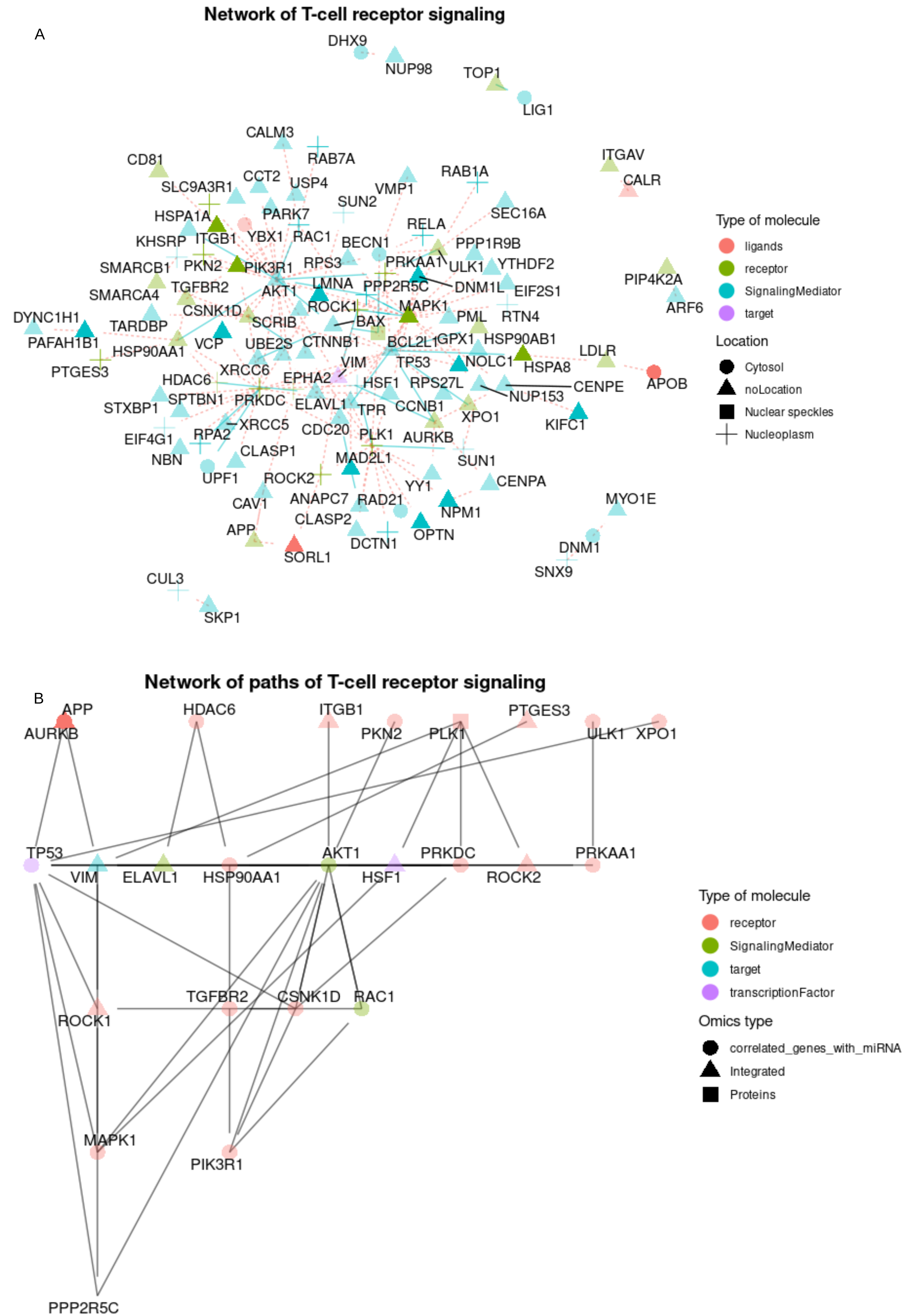
Demonstrational data from omnipathr. Visualization of networks of prioritized features. (A) The user can use omnipathr to annotate their network based on various attributes like location (shape), type of molecule (color) and whether or not it belongs to a specific function of interest (T cell receptor signaling linked with transparency levels). (B) Specific deregulated pathways of the network are shown. The user can also choose to annotate based on the omics of origin of the prioritized features.